Evaluation Metrics
Assets & Materials
| Interactive evaluation metrics demo. | /metrics-demo/?runvskisim=1 |
The throughline is error, redefined. Each metric is a different answer to the same question — how far off were we, and in which direction? R² measures error against the variance of the target. MSE squares residuals before averaging. Accuracy counts heads; precision and recall ask which heads. AUC sweeps every threshold into a single number. Same data, five lenses.
Open the interactive demo — every section below has a graph there you can poke at; the readouts update live as the data moves.
R² — how much variance did we explain?
Start with regression. We fitted a line through a scatter of points, and now we want a single number that says whether the line is any use. The laziest answer is “compute the average error” — but a raw error number means nothing on its own. An average residual of 2.5 is excellent if the target swings over hundreds of units and useless if it swings over five. We need a relative score.
R² (the coefficient of determination) supplies one by comparing our model to the laziest possible baseline: a flat line at , the mean of the target. That baseline model has by definition. A perfect fit has . In between, R² is the fraction of the variance in that our line accounts for:
is the sum of squared residuals left after the fit — the variance our model failed to capture. is the total variance of around its mean. Their ratio is the fraction of variance we missed; subtract from 1 and you get the fraction we explained. The mean line in the figure below is the baseline; the slanted blue line is the OLS fit. Watch R² climb as the cloud tightens around the line and collapse as the cloud swells toward the mean.
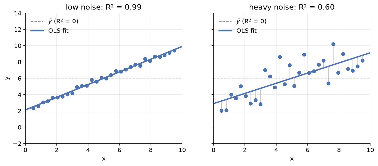
Two things R² is not. First, it is not “accuracy” — that word belongs to classification, and a regression with can still be badly biased (a consistent slope error, for example, that the line absorbs). Second, R² can go negative: if you fit a worse-than-mean model (say, by holding the slope fixed at a silly value), and . A negative R² is the metric telling you the model is worse than predicting the average every time — listen to it.
MSE, RMSE, MAE — three ways to score an error
R² is relative. Often you want an absolute error in the same units as the target — so you can say “our predictions are off by about 2 mm” rather than “we explain 87% of the variance.” Three classic choices, and they disagree loudly about outliers:
MSE squares every residual before averaging. Squaring does two things: it makes every error positive (so positives and negatives don’t cancel) and it makes large errors count disproportionately — a residual of 4 contributes 16 to the sum, while four residuals of 1 contribute only 4. MSE is therefore sensitive to outliers in a way MAE, which only takes absolute values, is not. RMSE is just MSE square-rooted back into the target’s units, so it is comparable to MAE on the same scale.
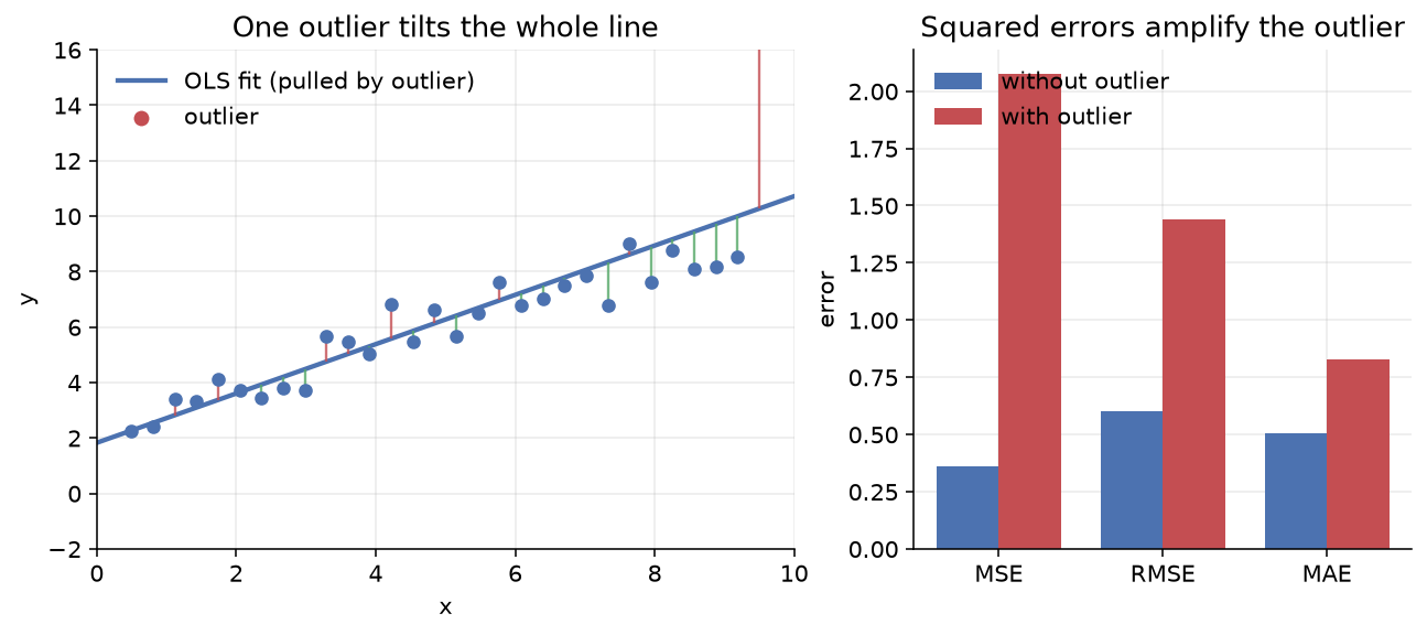
The figure shows the asymmetry directly. Move one point up by eight units and the whole OLS line tilts toward it (squared-error loss gives the outlier huge leverage — this is the same property that drives gradient descent downhill). The bars on the right tell the rest: MSE roughly triples with the outlier, while MAE barely moves. This is the whole argument for MAE (and for quantile regression, Huber loss, and other robust alternatives): if your data has contaminants or fat tails, MSE will chase them and lie to you about average performance.
The practical rule: reach for RMSE when large errors are disproportionately bad (a forecast off by 10 is more than twice as bad as one off by 5 — think demand planning, where a big miss breaks the supply chain) and MAE when errors are linear in cost (a miss is a miss is a miss — think predicting a median price). Report both. If they disagree sharply, your residuals have fat tails, and that is itself a finding.
Accuracy
Switch to classification. The obvious metric is the one we use in everyday life: what fraction did we get right? That is accuracy:
where are the four cells of the confusion matrix — true positives, true negatives, false positives, false negatives. Pick a decision threshold (everything above it is predicted positive, everything below negative), count the four cells, and accuracy falls out as the diagonal sum over the total.
The two histograms below show the model’s decision scores for each class (negatives in blue, positives in green), with a dashed threshold at 0.5. Move the threshold and the confusion matrix repopulates; accuracy is the green-plus-blue share of the total in the title.
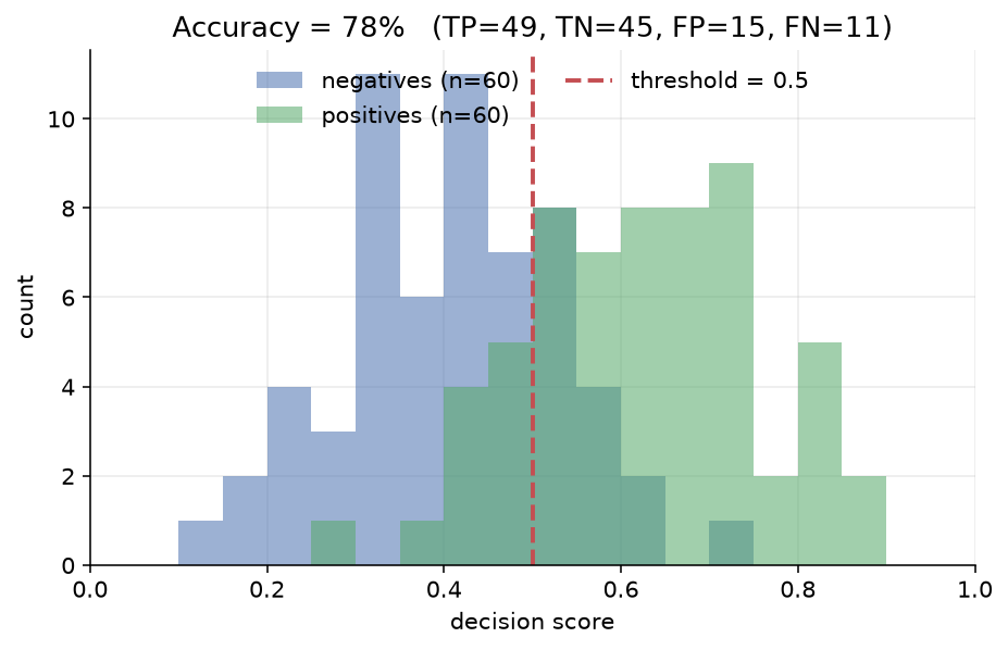
Accuracy’s appeal is its simplicity, and that is also its trap. Accuracy lies when the classes are imbalanced. If 99% of your samples are negative, you can hit 99% accuracy by predicting “negative” every time — a model that has learned nothing. The confusion matrix exposes the failure (one giant cell, everything else empty) but the headline number hides it. Even when the classes are balanced, accuracy collapses two different kinds of error — false positives and false negatives — into one bucket, as if their costs were equal. They rarely are. A spam filter that deletes a legitimate email (false positive) is much worse than one that lets a spam through (false negative); an accuracy of 99% tells you nothing about which kind of mistake you’re making.
This is the bridge to the next section. Accuracy asks “how many did we get right?” The two questions that actually matter are: of the points we flagged, how many really were? and of the real ones, how many did we catch?
Precision, recall, F1?
Two metrics untangle the two error types:
Precision asks: of the points we flagged positive, how many really were? A precision of 0.9 means 90% of our alarms were real. Recall asks: of the real positives, how many did we catch? A recall of 0.7 means we missed 30%. They pull against each other — raise the threshold (be more selective) and precision climbs while recall falls; lower it (flag more aggressively) and recall climbs while precision falls. The only way to raise both at once is to make the model itself better.
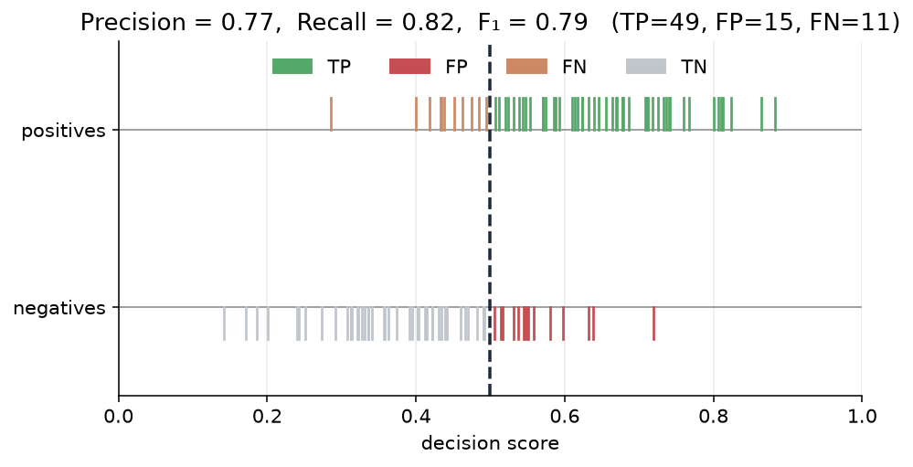
The figure colours each sample by its role at the chosen threshold: emerald ticks are , rose are , amber are , faded grey are . Reading it: precision is the green share of everything to the right of the threshold on the upper (positives) rug; recall is the green share of the entire upper rug. Slide the threshold and watch one rise as the other falls.
Which one matters depends on the problem. Cancer screening wants high recall — missing a real case is catastrophic, so accept a flood of false positives (the biopsy will sort them out). Search ranking wants high precision — a user who clicks the first result and finds it irrelevant won’t keep scrolling. Spam filtering wants high precision — a false positive (a real email in the spam folder) is much worse than a false negative. There is no free lunch; the threshold is a dial you turn according to the cost structure of your problem.
is the harmonic mean of precision and recall — a single-number summary that punishes either being low. (The harmonic mean of 0.99 and 0.01 is 0.02, not 0.5; you cannot paper over a disaster in one metric with strength in the other.) weights precision and recall equally. When they are not equally important — when, say, recall is twice as valuable as precision — use the generalisation with to up-weight recall.
ROC and AUC — one curve for every threshold
Precision and recall are functions of the threshold you picked. What if you want a single number that summarises how well the score separates the classes, independent of any threshold? That is what the Receiver Operating Characteristic curve delivers.
Every threshold gives you a pair — the false-positive rate and the true-positive rate:
Sweep the threshold from high (predict nothing positive — both rates are 0) down to low (predict everything positive — both rates are 1) and those points trace the ROC curve. A model with no signal sits on the diagonal: at every threshold, no better than a coin flip. A perfect model hugs the top-left corner: at . The area under the curve (AUC) collapses the whole curve into a single number between 0 and 1 — and it has a clean probabilistic meaning: the chance that a randomly chosen positive is scored higher than a randomly chosen negative.
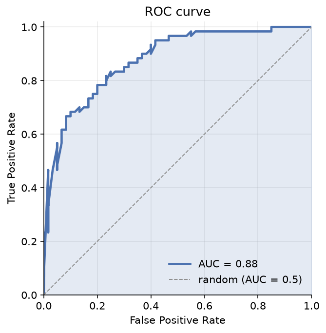
AUC is threshold-free, which is both its power and its limitation. Two models with the same AUC can have very different curve shapes — one might dominate at low FPR (good when false alarms are costly) and the other at high FPR. If you know the operating region you care about, look at the curve, not just the number. And AUC, like accuracy, says nothing about the calibration of the scores — two models can separate the classes equally well but one might output well-calibrated probabilities while the other outputs scores you have to squash through Platt scaling before they mean anything.
The classification essays later in this handbook report AUC alongside accuracy and F1 for exactly this reason: AUC is the threshold-independent baseline, accuracy is the metric for one chosen threshold, and F1 is the precision-recall summary. Read together they tell you not just how good but good where.